Question: What do comics, monsters, and a spoon have in common?
On a hunt for expert marketing tips, you are probably aware how fast comics are moving into every area of marketing. They are just too powerful of medium to ignore. The narrative art medium is rapidly spreading everywhere. I’ll explain why in an in-depth (easy-to-read) analysis of one great comic book launch outside the normal means.
Inside you’ll find tips to help you sell your art and your products for more money. (info packed and pictures included)
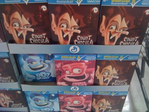
So what do comics, monsters, and a spoon have in common? The answer is this new marketing technique by General Mills to push their Count Chocula, Boo-Berry and Frankenberry Cereal.
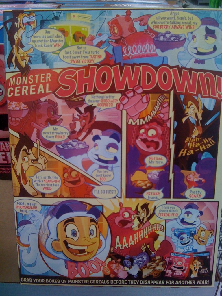
TIP #1 — Use Narrative Art. Imagine your kid eating a bunch of Count Chocula for breakfast and reading the back of the cereal box. Every day, they will continue reading the box. Every morning the message on your box will be engraved in their brain. This is a great technique. You never lose a fan. Every comic book artist already knows this. Using the right story at the right time everyday. Using the narrative art technique is the best marketing technique you can use to build a fan for life.
TIP #2 — Use new re-launch techniques. These cereals have been around since at least the 70s and continue to generate some income for its company. These cereals are never the best sellers and would probably lose money sitting on the shelves everyday, but a one time relaunch will make the company probably as much as they would the entire year in only a few weeks. Work smarter not harder. Are you working all year for your income? Try changing your perception to focus on 2 or 3 week launcha and see what happens.
TIP #3 — Launch around an event people will respond to. This product is perfect blend of Monster Cereals and Halloween. What better event for these monsters to make a comeback and what better way for them to make a comeback. Spooky Halloween Spectactacular. Matching their monsters with the greatest monster mash of the year doesn’t get any better. How can you make a launch event for the characters, portfolio, or story that will make people pay attention to.
TIP #4 — Tell a compelling story. The narrative art medium tells the story of a battle with 3 monsters. This is probably the best part of the campaign. They got all the elements pulled together perfectly, just using the narrative art medium is enough to hook kids in with a enticing, funny storyline that will engage them all throughout their their breakfast morning day. It starts their day off with a chuckle and gives them a joke to share with their friends. Plus they are engaged in the monster’s world. You have to have a story that will compel kids and people to keep reading or keep using your product. The lesson for you is to make your story fit your audience. In the time and place that is perfect for your audience.
TIP #5 — Don’t spend too much without knowing it will work.
Noticeably absent is the QR Code. This is how powerful the narrative art medium is. If one page can do this how much woul 8 or 16 pages do? You would probably have a customer for life. I’m not sure 1 page is possible for that. But it is enough to sell a box of cereal and have a kid remember you for a long span of time. What if for just a few bucks more that it took to create this box, they followed up the teaser on the package with a linked QR code that let the kids read an online comic book that engaged the kids further into the monster’s world. The reason they didn’t is they just don’t know if people will like this launch. If sales are good. I imagine next year they will do something like that and capture some more interest and feedback. General Mills is on the right path with this. Hopefully, they will continue in this path and make it more and more profitable for future launches.
TIP #6 — Use the correct artwork style. This style is geared to attract kids. The look emulates Saturday morning cartoons. And they use a REALLY BIG human face. Even though it is a mask. Kids can see this from further away. We always connect with human faces. On artwork this is even more so effective. The face has big eyes to connect with those looking at it. And the face is smiling. As an editor, I wonder how many revisions this cereal package had before they came up with a final design.
TIP #7 — Scarcity. They aren’t leaving this package out on the market for very long. It is implied that you have to get this special cereal NOW. Because after Halloween, you are going to have to wait until next Halloween to see it again. The guys at General Mills are geniuses.
Now see what can you learn from these guys and to make your comics stand out better and go be the Best Comic Book Creator EVER!

